Which makes more sense?
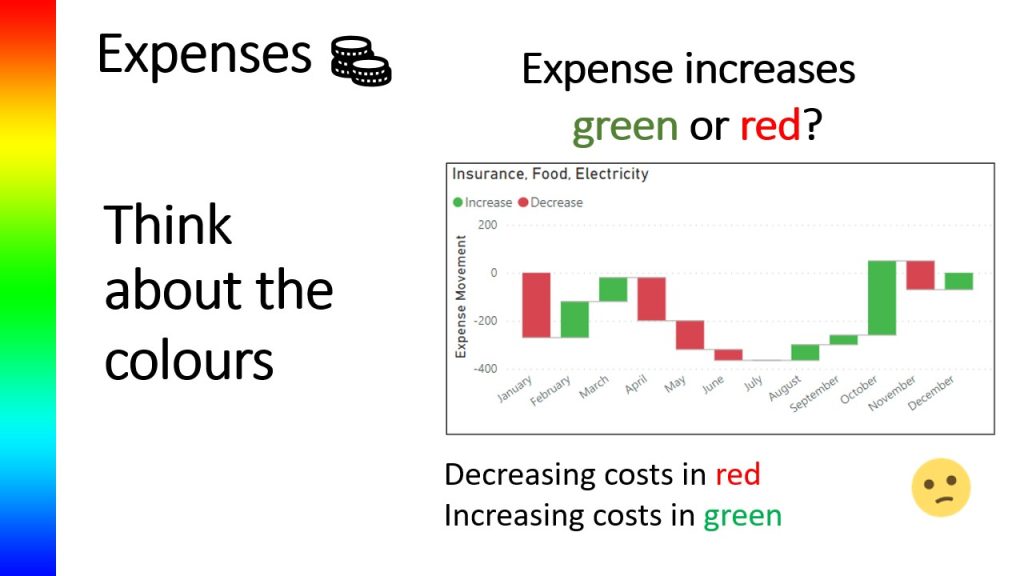
The above two waterfall diagrams shows month on month movement of the three expenses which have been grouped together. The waterfall was created using Power BI and the default colours used by Power BI are shown in the top diagram which shows an increase in expenses by colouring the bars in green, with decreases in expenses shown in red.
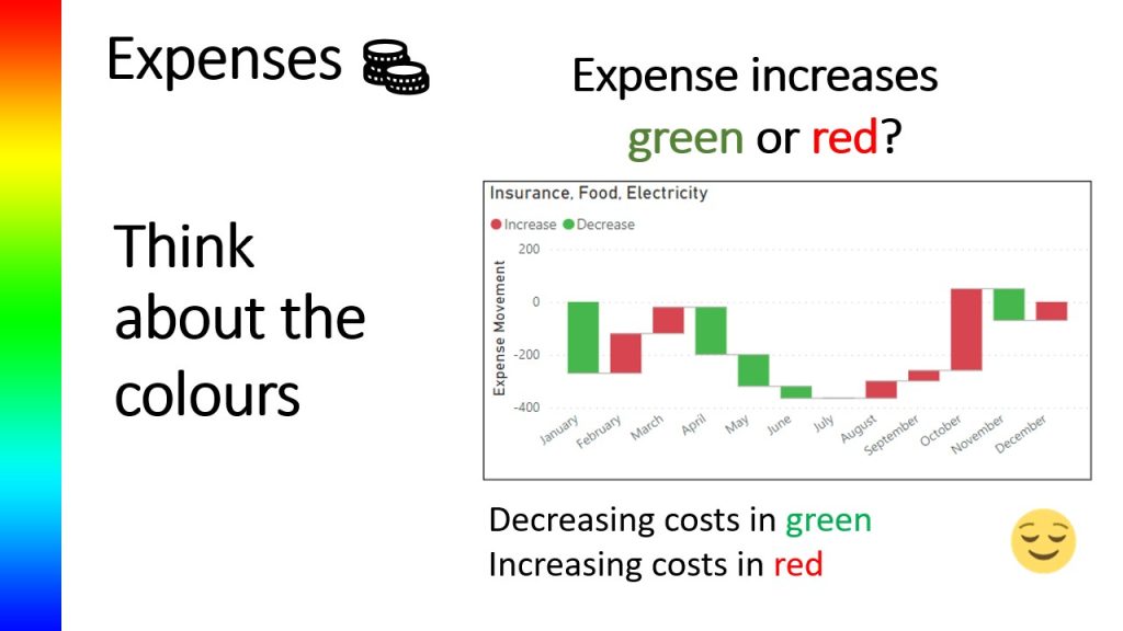
The second diagram shows the opposite, the increases are in red and the decreases are in green.
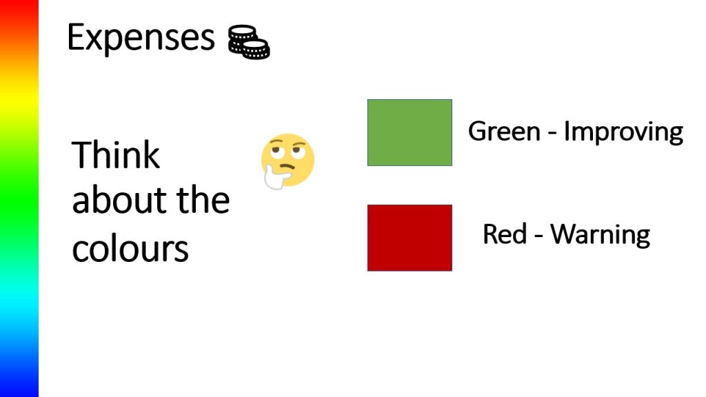
We are dealing with expenses, so think about the colours. Typically in financial diagrams, green is usually associated with something improving with red acting more as a warning.
Returning to the first diagram, when a user see’s red bars do you think they will realise that the costs have actually decreased by just over 200 in the respective currency in January from a base of zero, or do you think they will see the red and subconsciously associate red as a warning sign that there is a problem to be explored further or indeed look at February where costs have increased by around 100 yet they are in green which may make the user subliminally think that all is well. If a user just glances at the report they could easily end up confused at the story it the diagram is attempting to tell.
If I look now at the second diagram, in January the decrease is shown by a green bar, whereas the increase February is shown by a red bar. If a user glances at this, this time they have a clearer indication that costs have increased in February
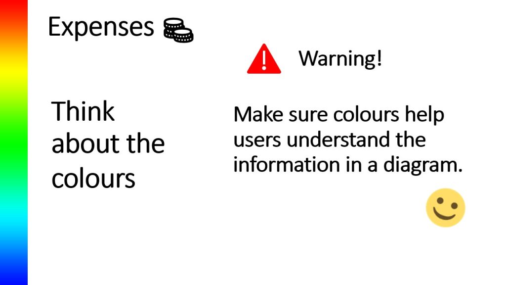
So please be careful when using colours. Make sure that the colours used in diagrams help the user to clearly understand the information the data is providing.
YouTube video - combines the words and slides above