Blog
Talking About All Things Data
Data visualisations, Dashboards/Reports, and the People & Process that make Data Projects successful

Hitting the target doesn’t mean everything is fine
A target is hit. The dashboard shows green. The bonus is paid. All is well. Everyone’s happy. Well … that is until a problem arises. Most reports and dashboards are built around…

Why Patience Belongs on a Data Analyst Job Description
You don’t usually see “patience” listed on a data analyst’s job description. You see requirements for SQL, Power BI, or Python, but not the requirement to sit with a problem…
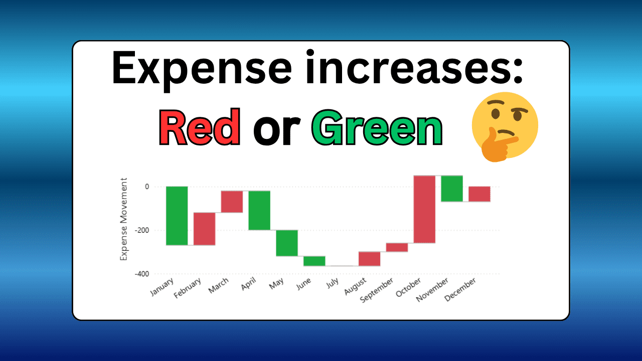
Be Careful if Using Red and Green in Financial Charts
Do the Colours in Your Chart Tell the Right Story? Picture this. You are in a meeting, someone pulls up a dashboard, and within seconds a hand goes up — “Why are costs so high…
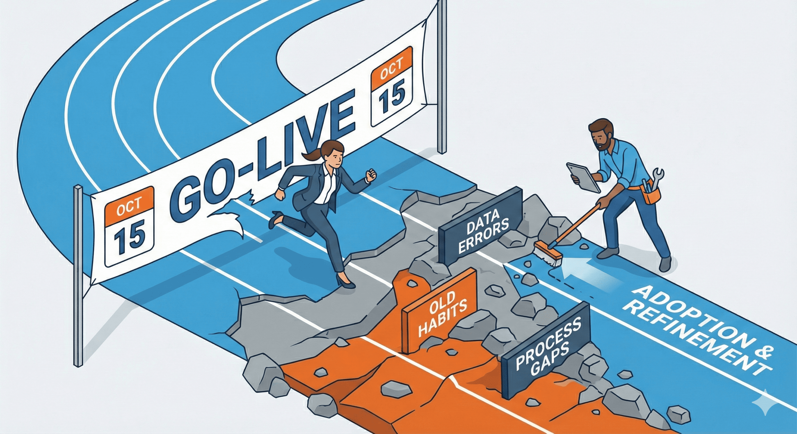
Why a Data Analyst’s work isn’t finished when the system goes live
When a data analyst helps build a new reporting system, the process usually goes like this: the data is moved, then the new system goes live. At this point, it is often assumed…
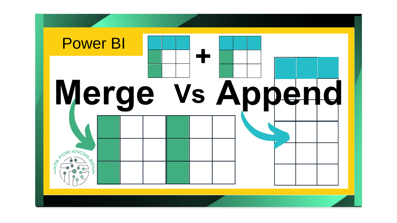
Merge vs Append in Power BI: What’s the Difference?
You have the option to Merge or Append in Power BI, which do you choose? You’re working on a Power BI report, and you are looking to combine data from two different sources into…
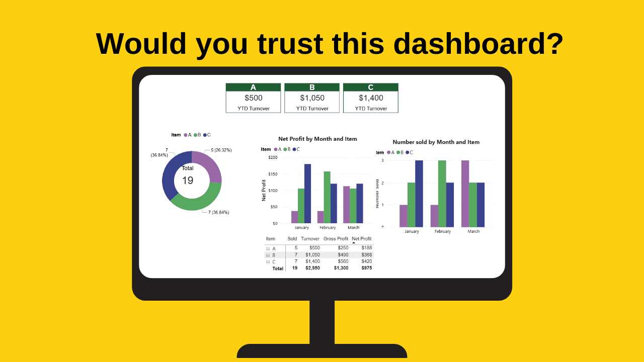
Why the Small Finishing Details on a Dashboard Matter More Than You Think
Have you ever looked at a dashboard and your gut is telling you that something feels slightly off, but you can’t quite put your finger on why? The data is right. The calculations…
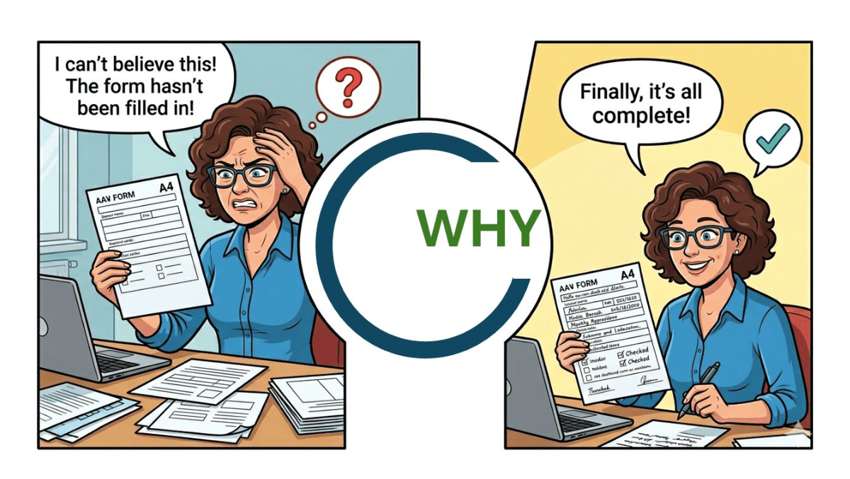
Close the loop. Explain ‘why’ the data input matters
The Common Problem: Treating Data Input as “Admin” “They know they should be filling in the forms but it’s just not getting done.” I’ve heard this frustration a few times in…
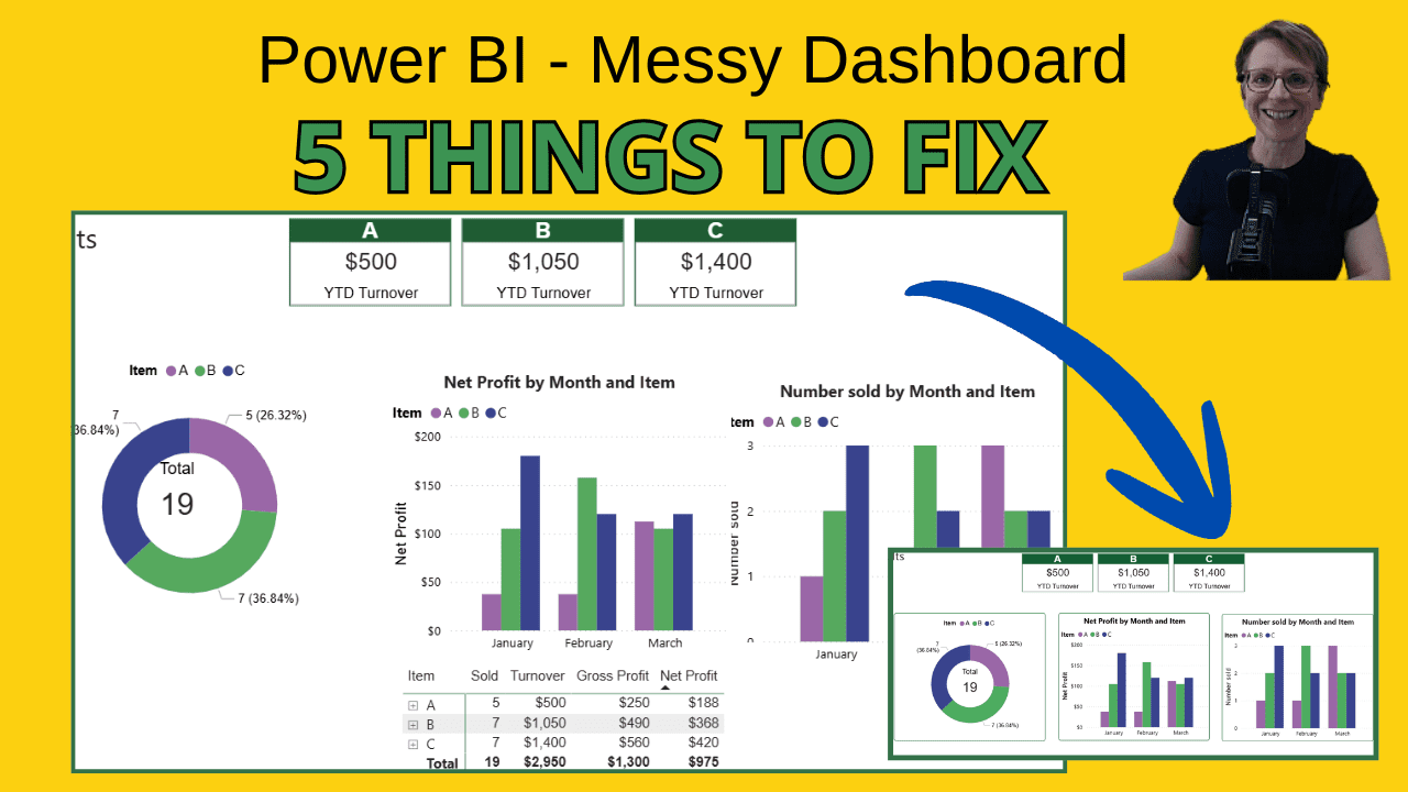
Power BI – messy dashboard
The follow along Power BI project in the YouTube video below shows 5 typesof changes which could make this dashboard look more professional. ThePower BI starter report used in…
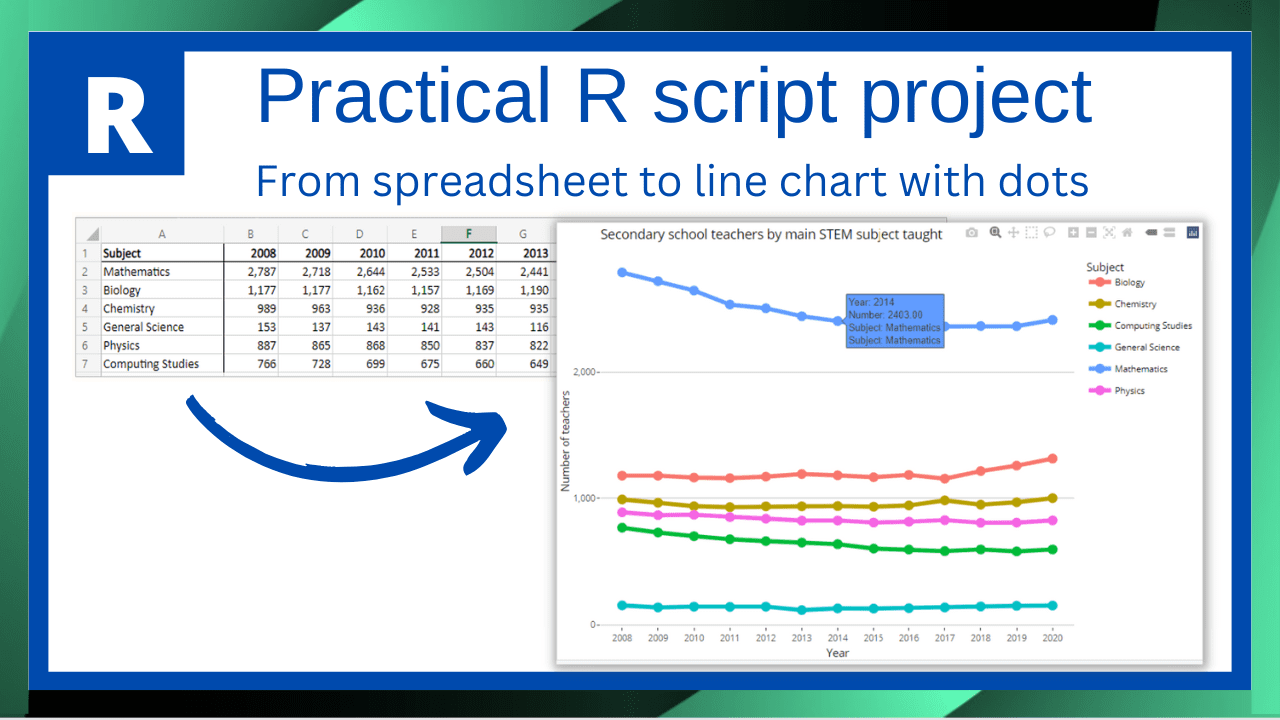
R Project – create line chart
Follow along practical example – In an R script upload a spreadsheet, manipulate the data by pivoting columns, and then producing a line chart with data points.
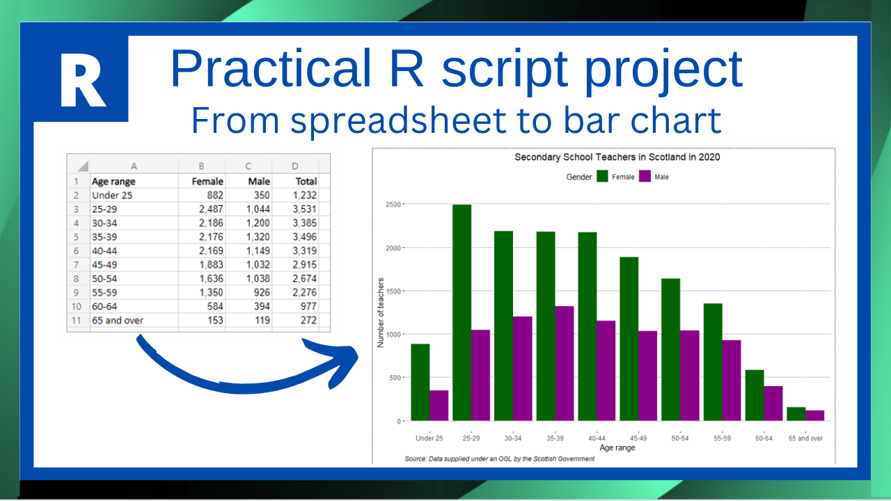
R Project – create bar chart using gglot2
Follow along practical example – In an R script upload a spreadsheet, manipulate the data by removing column/variable, change variable name, and pivot columns, and then producing a bar chart.
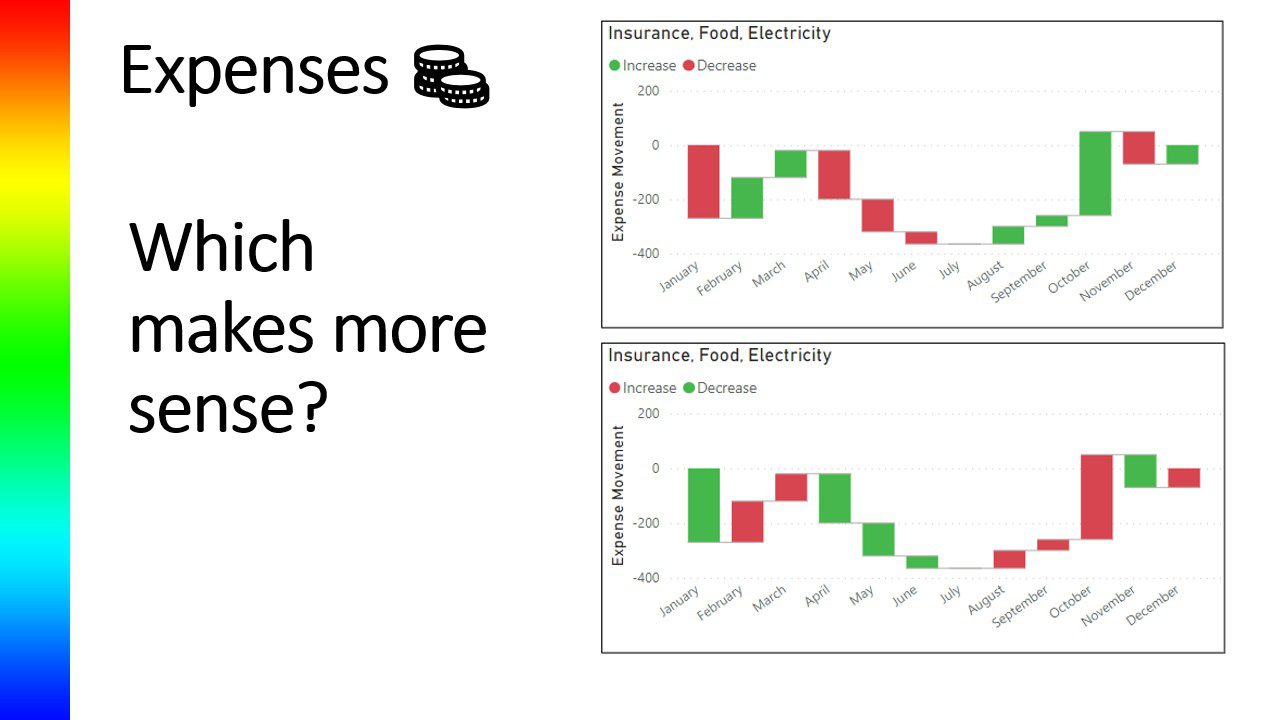
Which colours make sense for expense movements?
Which colours make sense for expressing expense movements? For these Waterfall diagrams the colours used to indicate month on month movement are discussed.
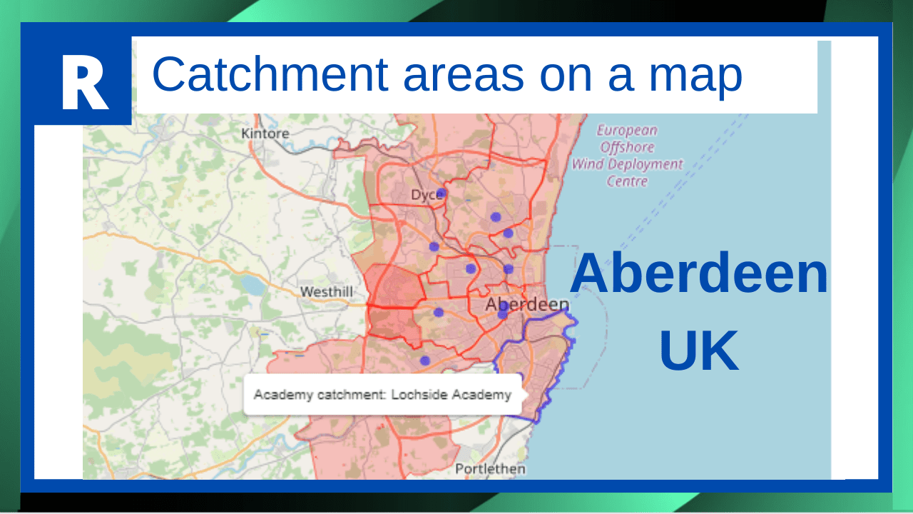
RShiny – add catchment areas to a map using geoJSON
This RShiny example shows how to add polygons to a map from a geoJSON file to show school catchment areas