Open Data
Articles and How to guides
YouTube
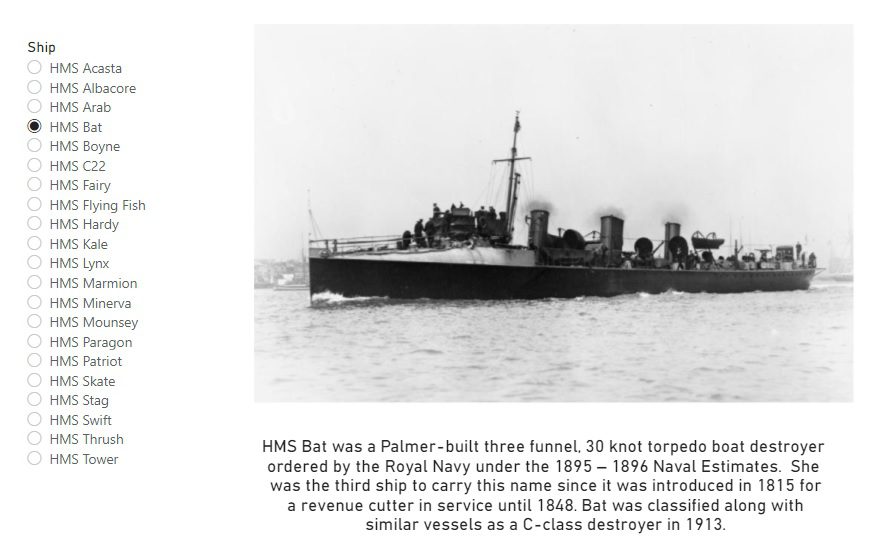
Wikipedia extracts for ships arriving in Aberdeen Harbour
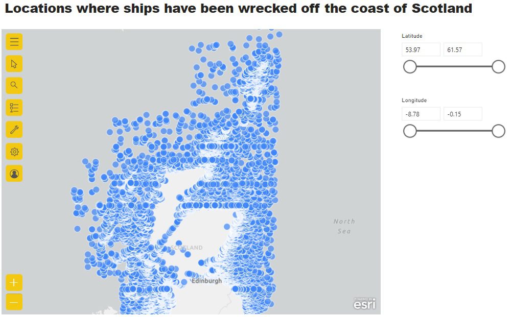
Mapping Wikidata Shipwreck data in Power BI
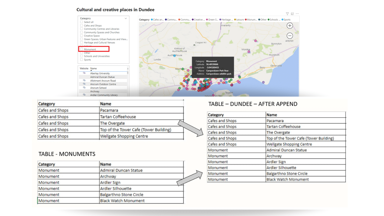
Combine Dundee places with monuments dataset using Append
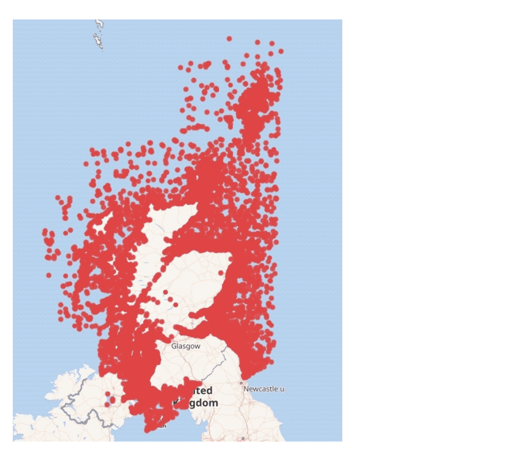
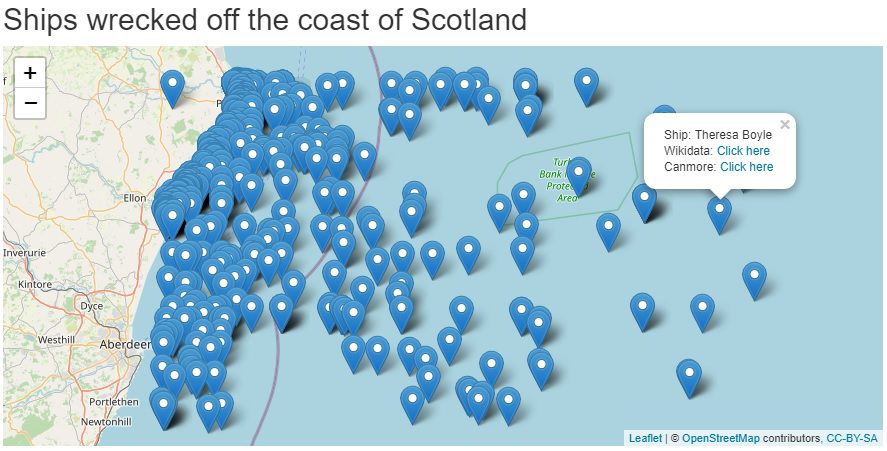
Mapping Shipwreck data in Wikidata
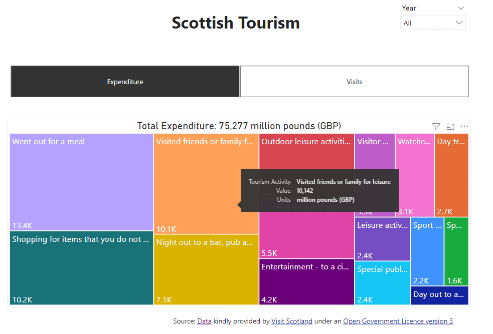
Treemap Power BI project using Scottish Tourism Open Data
RShiny project - Plot polygons from GeoJSON file to leaflet map and plot circles from excel file

R Project - create line chart with points (ggplot2 & plotly) from spreadsheet-includes data pivot

Track direction of ship movement in R Shiny app using AIS open data
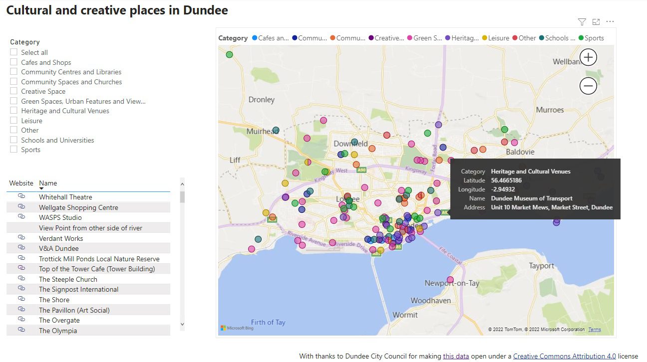
Dundee cultural and creative places
Mapping Wikidata Shipwreck data in an R Shiny App
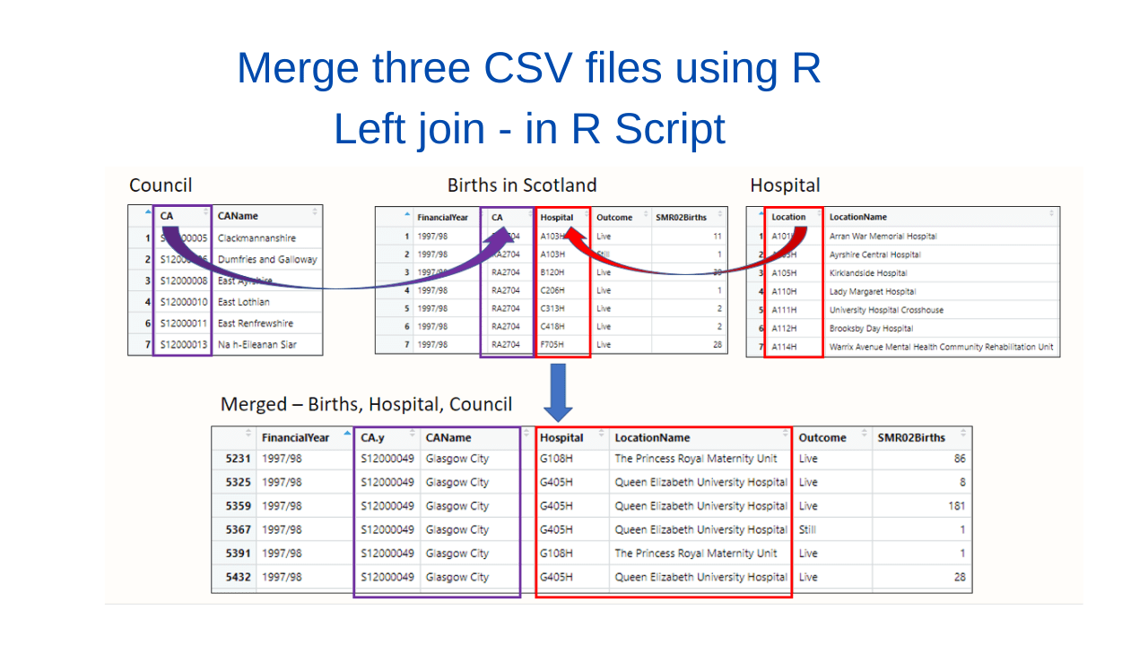
Merge - Left Join in R - using Births in Scotland Open Data
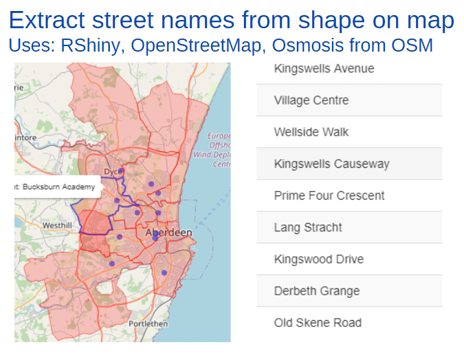
Using OpenStreetMap osmosis extract street names from polygon on map for display in RShiny table
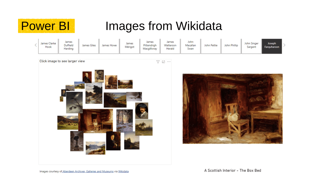
The user can view artwork held in Wikidata in Power BI.