May 20, 2026
Apr 22, 2026
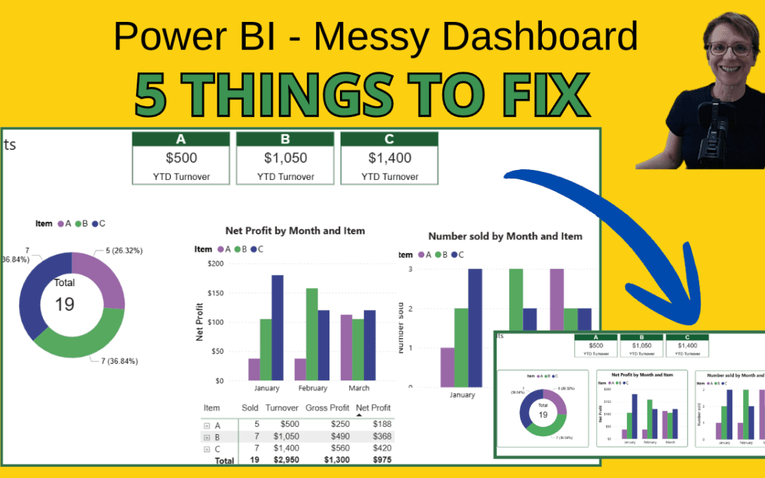
The follow along Power BI project in the YouTube video below shows 5 typesof changes which could make this dashboard look more professional. ThePower BI starter report used in the project can be found below. Power BI pbix file Note: Provided ‘as-is’; users...
Sep 22, 2022
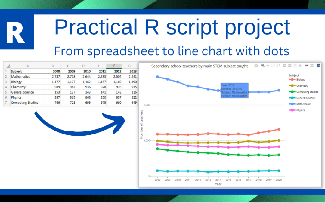
The follow along R project in the YouTube video below shows how to load a spreadsheet into an R script, manipulate the data by pivoting columns, and then producing a line chart with data points. The spreadsheet used in the project can be found below. The original...
Sep 21, 2022
Sep 12, 2022
Which makes more sense? The above two waterfall diagrams shows month on month movement of the three expenses which have been grouped together. The waterfall was created using Power BI and the default colours used by Power BI are shown in the top diagram...
Jun 8, 2022
This example using RShiny shows how to add polygons to a map from a geoJSON file to show school catchment areas. The school locations are then plotted. The geoJSON file used in this project can be found at:...